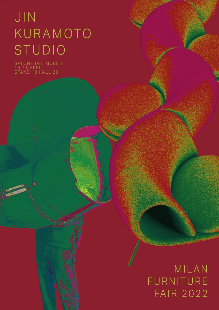
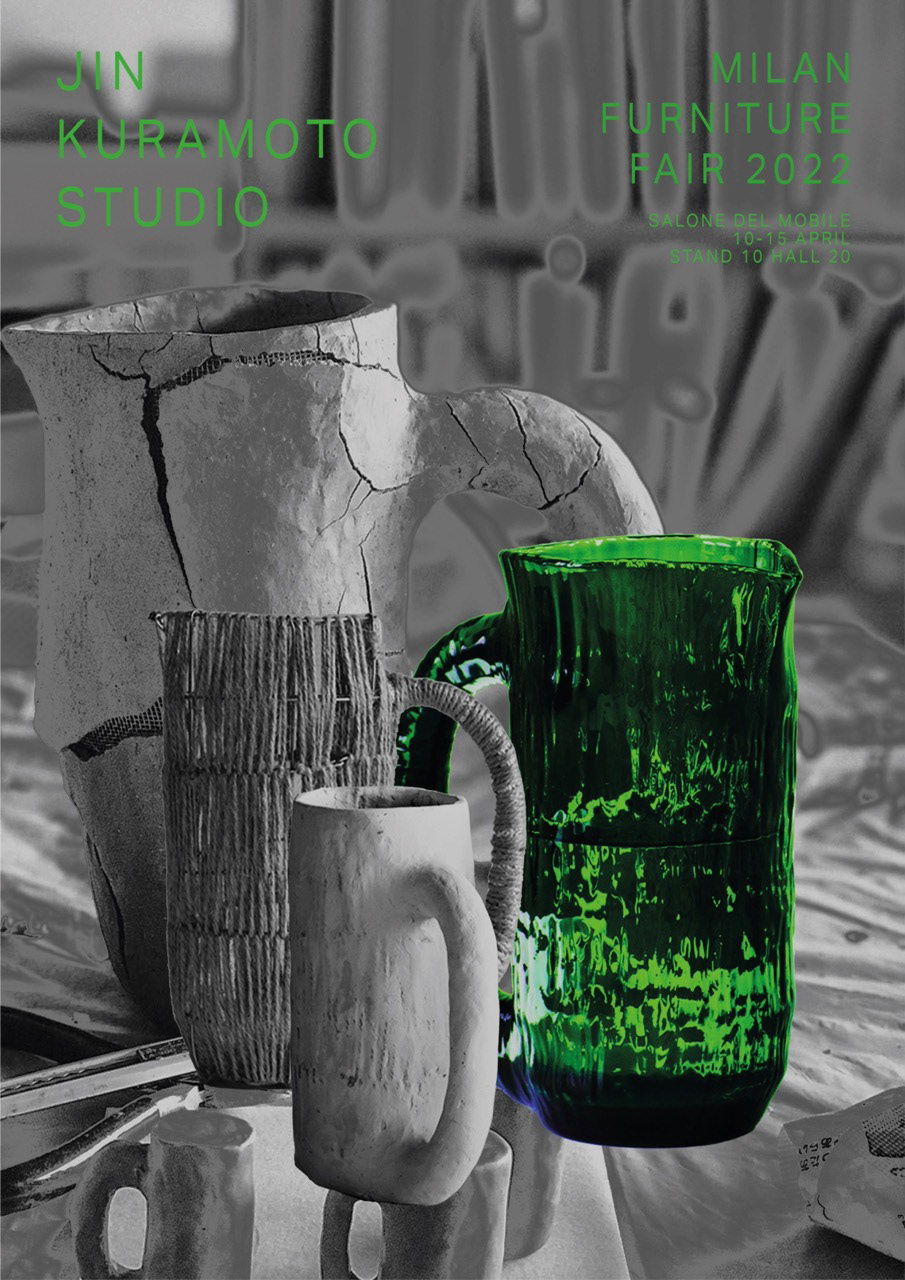
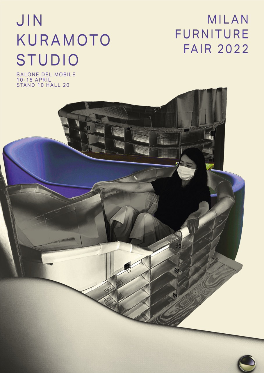
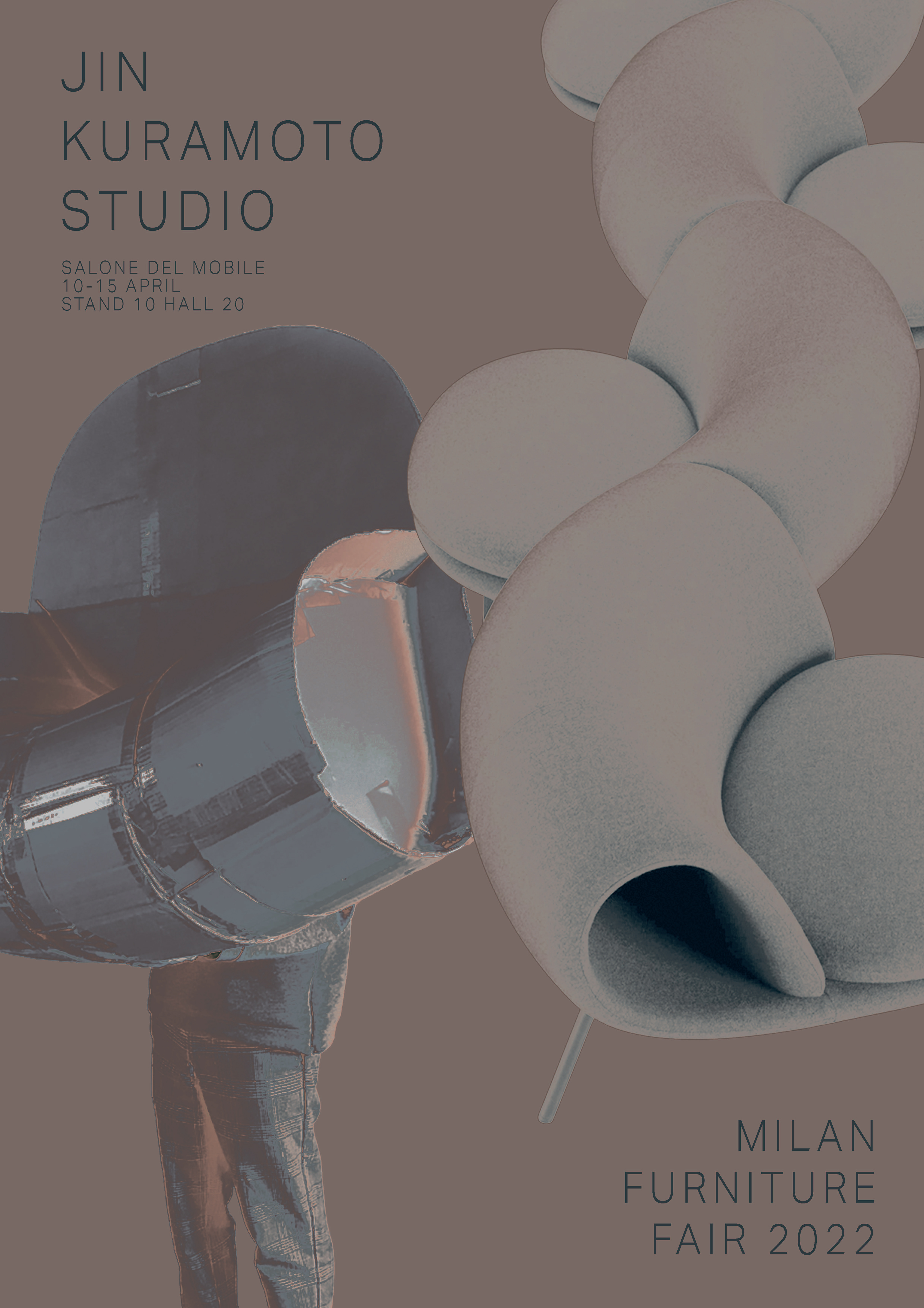
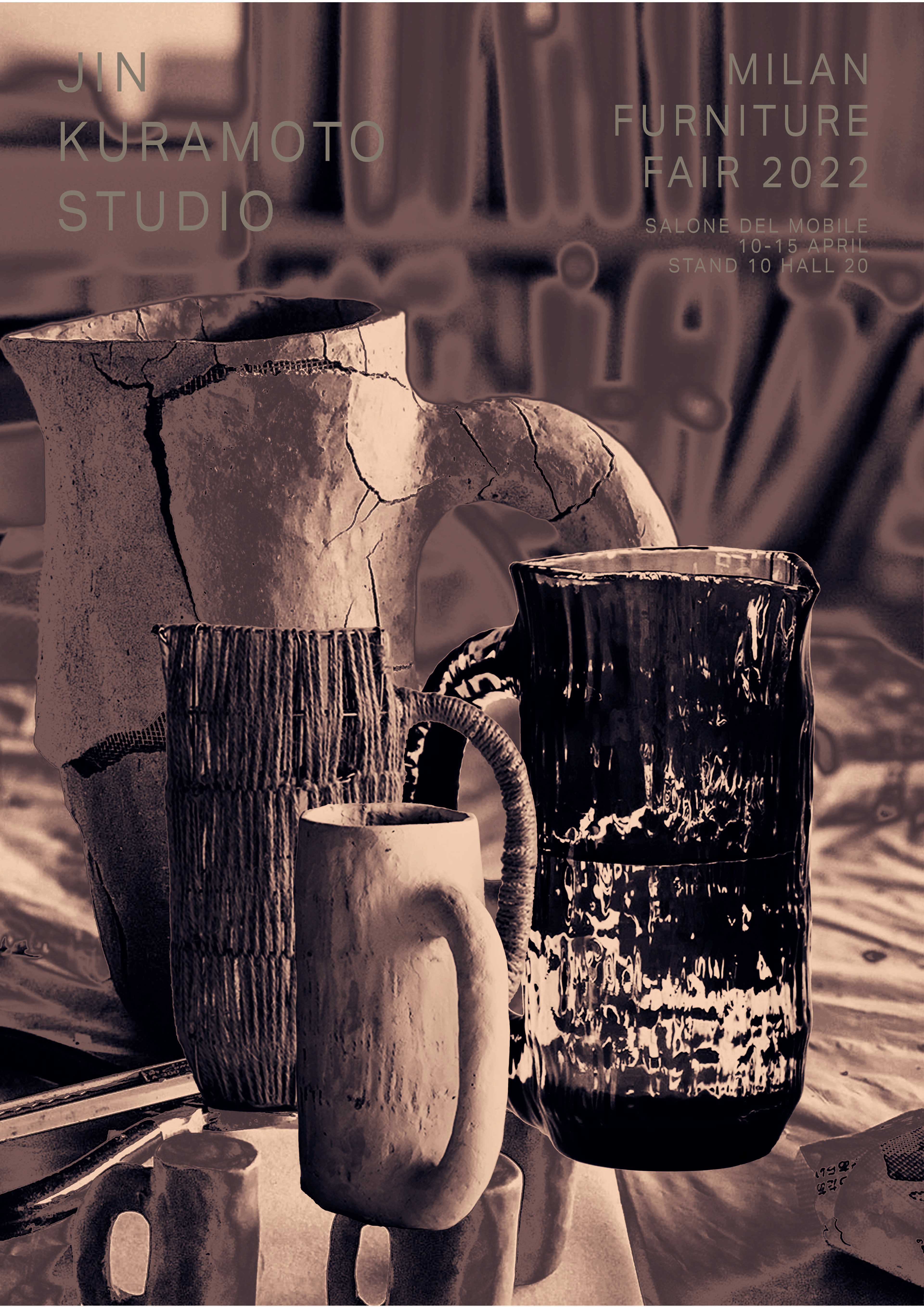
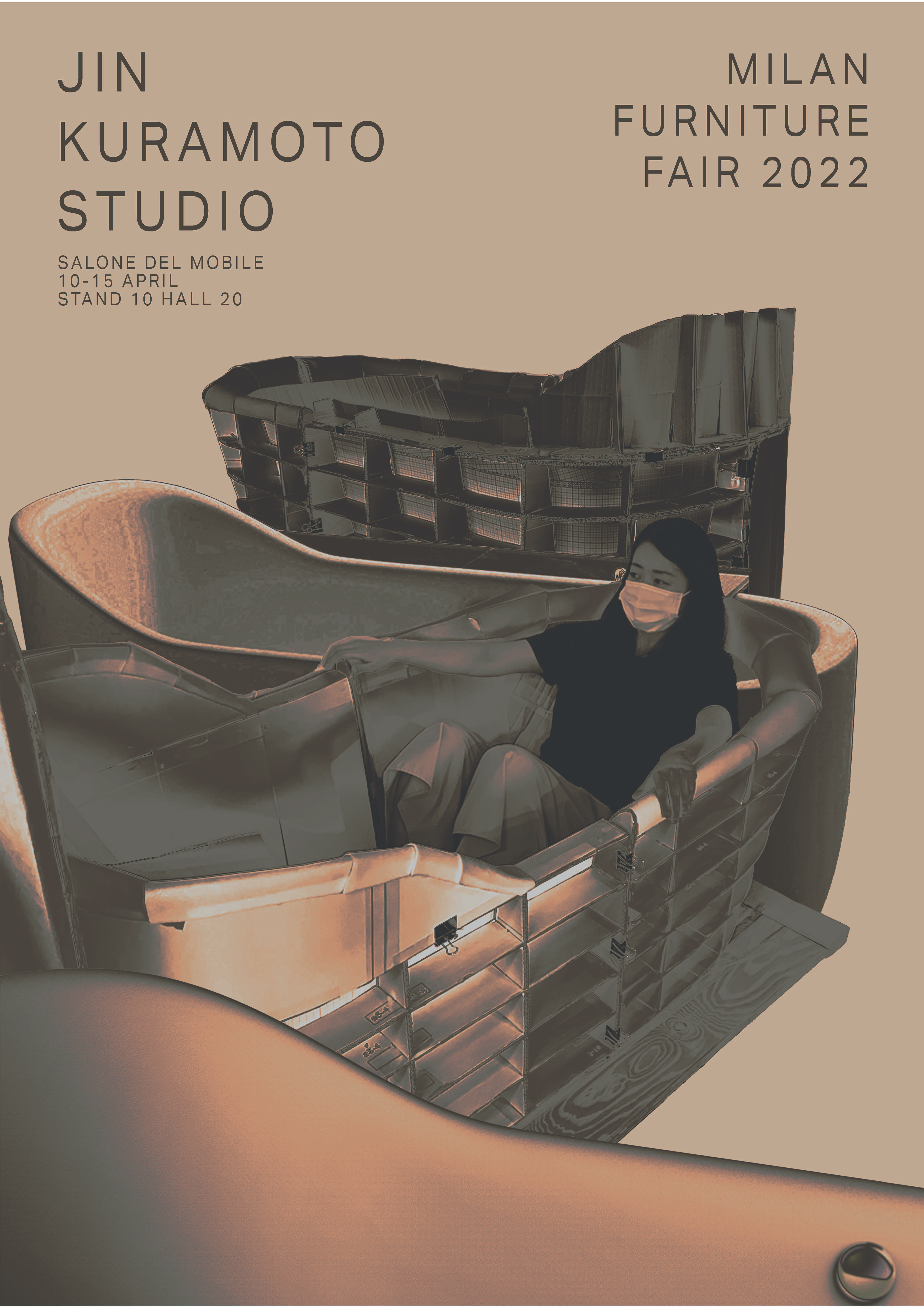
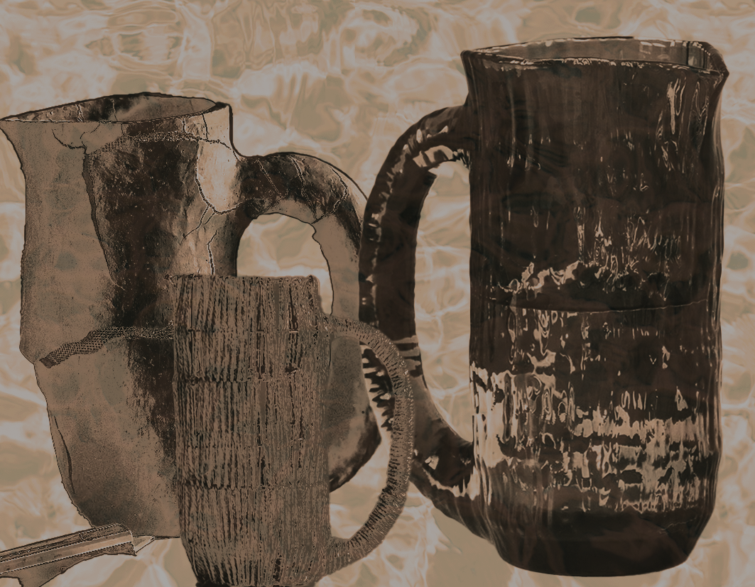
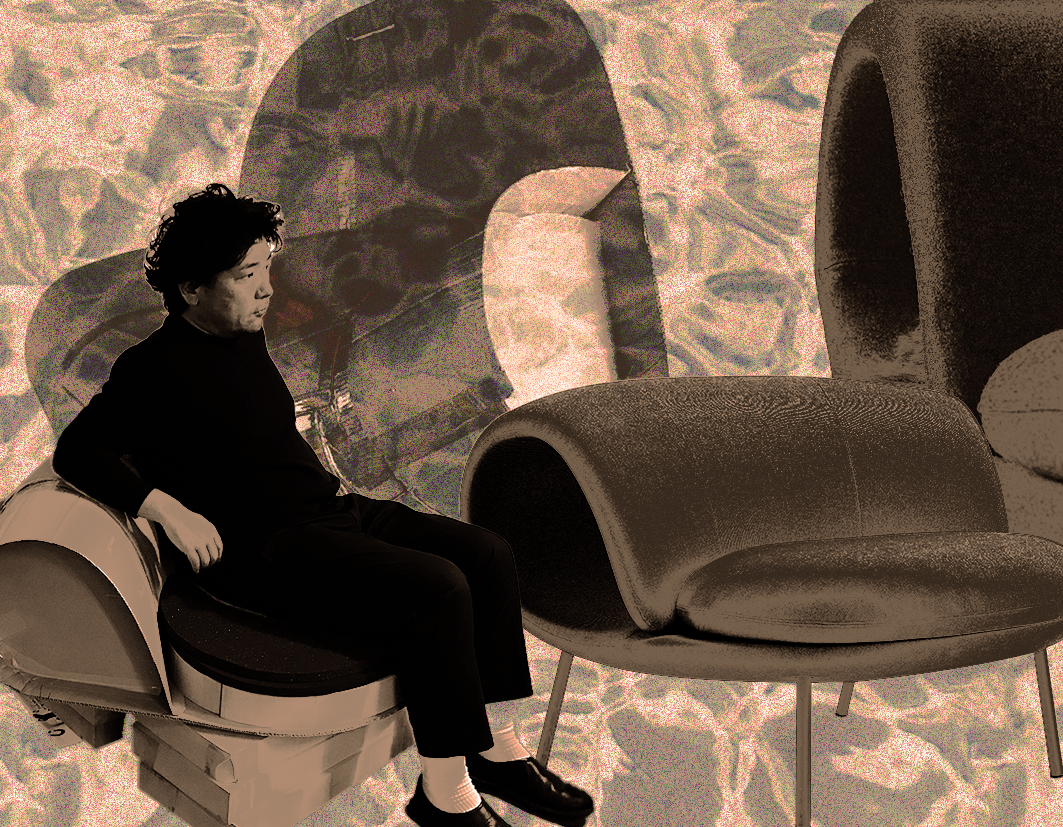
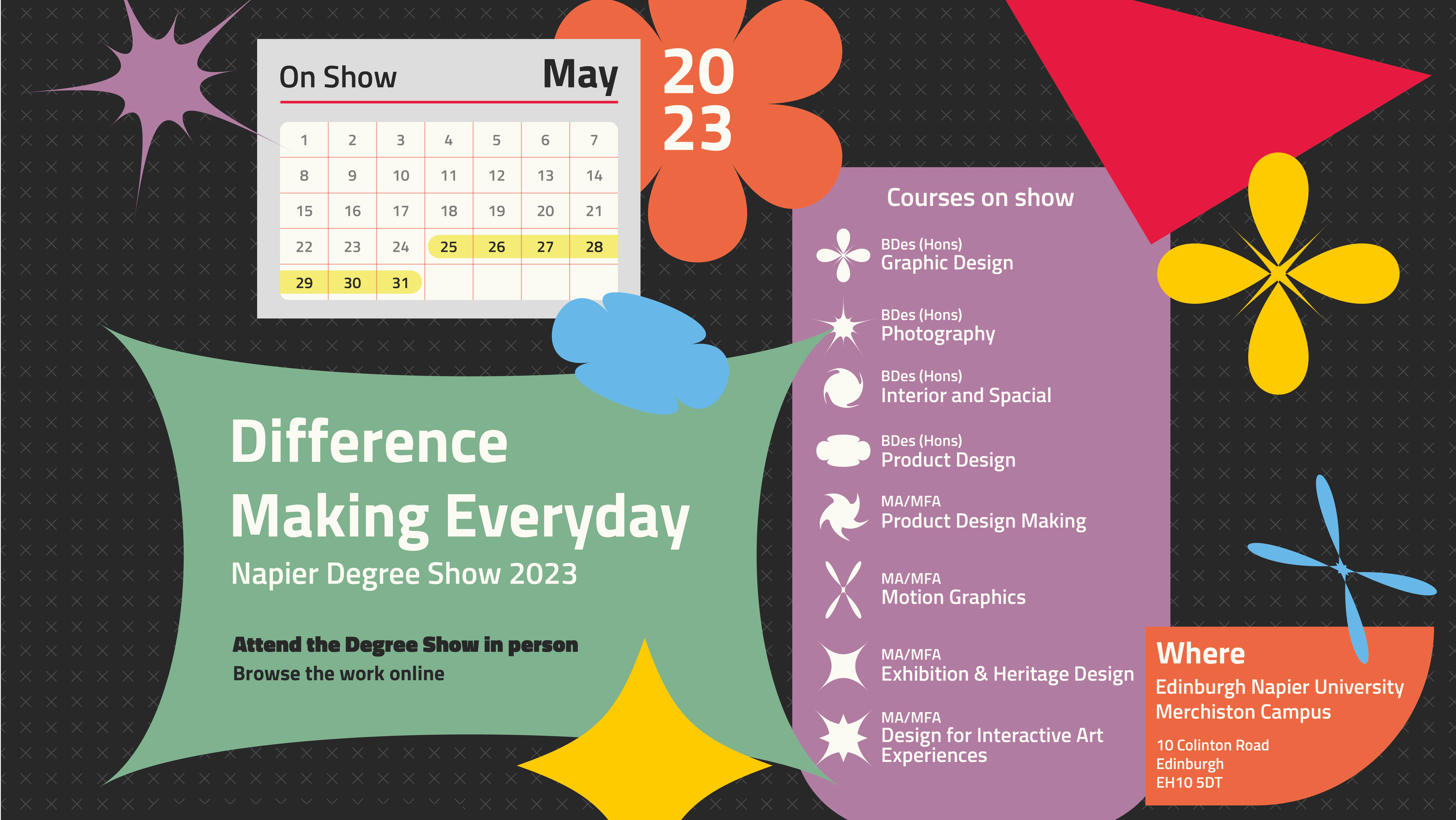
An inter disciplinary project with interior and product design students in my 3rd year to work as a team to create an exhibition space for two furniture companies at the Milan Furniture Fair, my group had two graphic students and we chose to pick a company each and work on them separately. I chose to work on Jin Kuramoto creating posters, postcards, an information flyer, band guidelines and working with the interior students to include aspects of graphic design in the exhibition space.
To include aspects of graphics in the exhibition space I proposed including light projections of the Jin Kuramoto logo onto the furniture and more specifically the tile walls that Kuramoto had.
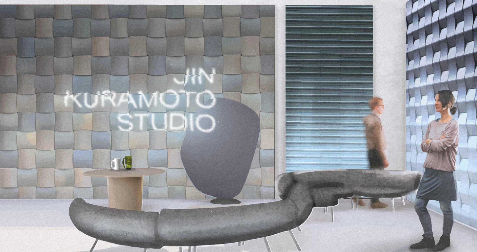
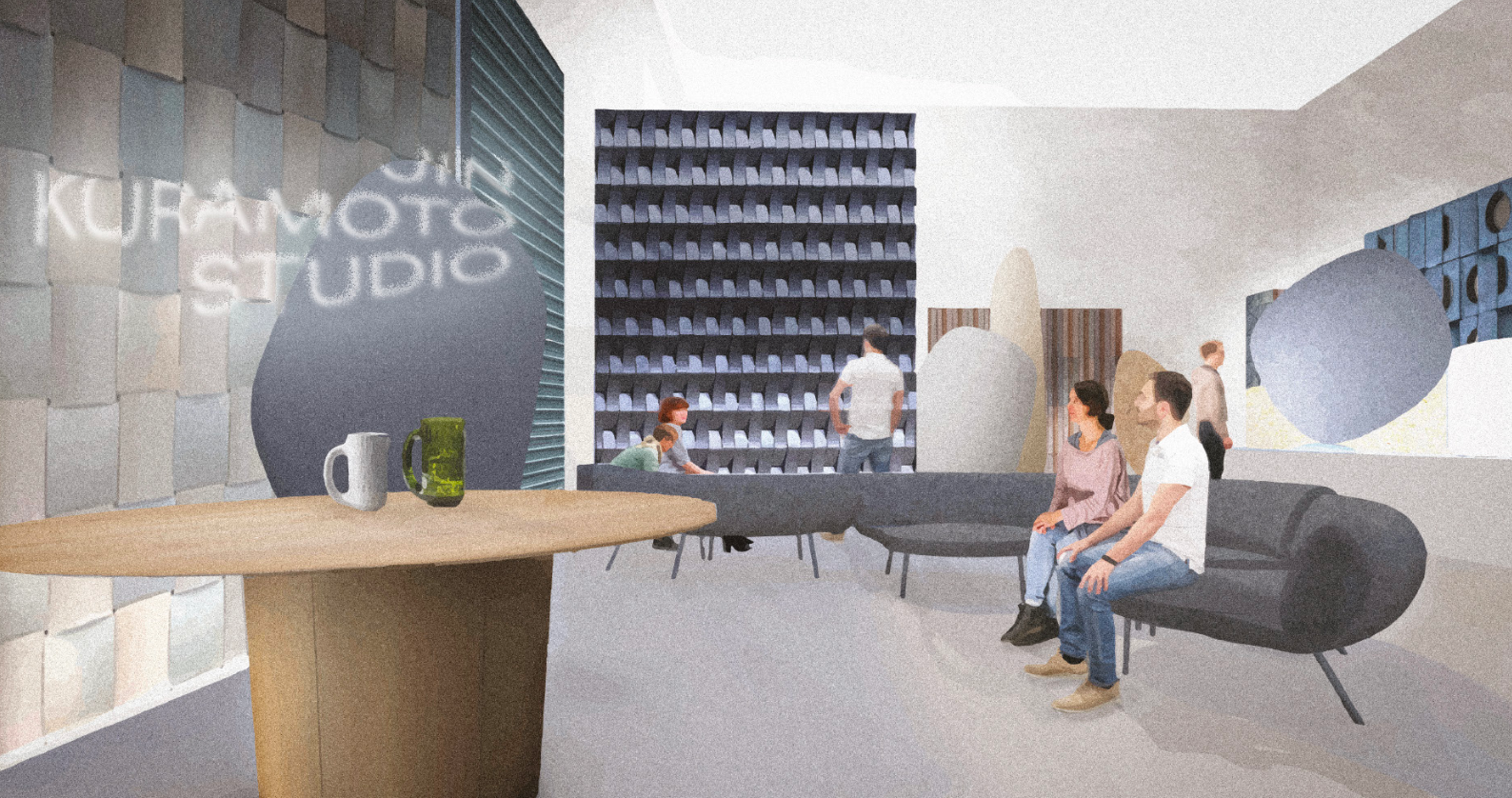
When it came to the publication design we wanted to reflect the design process of the Kuramoto products, this is also reflected in the exhibition space, this idea came from their website as it includes a detailed accounts of the design process of each/if not most of their products.
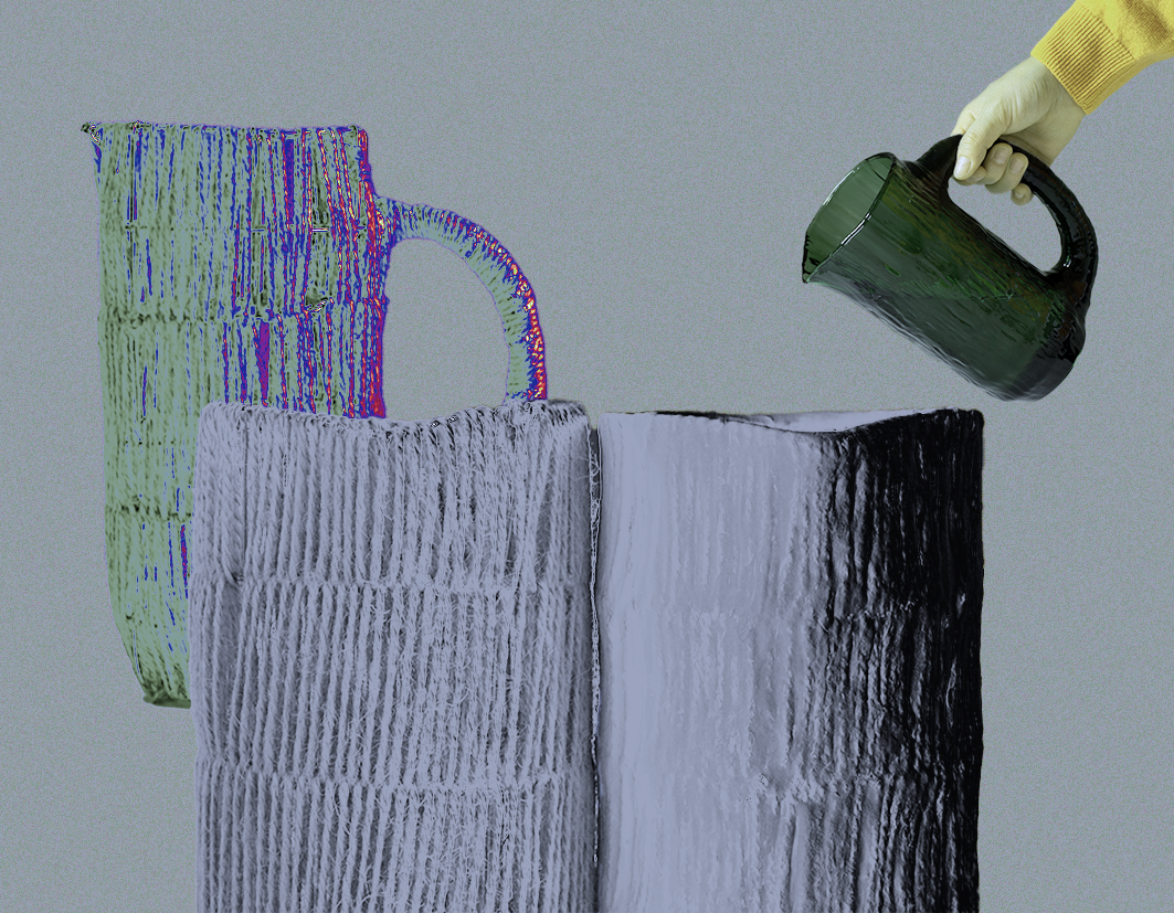
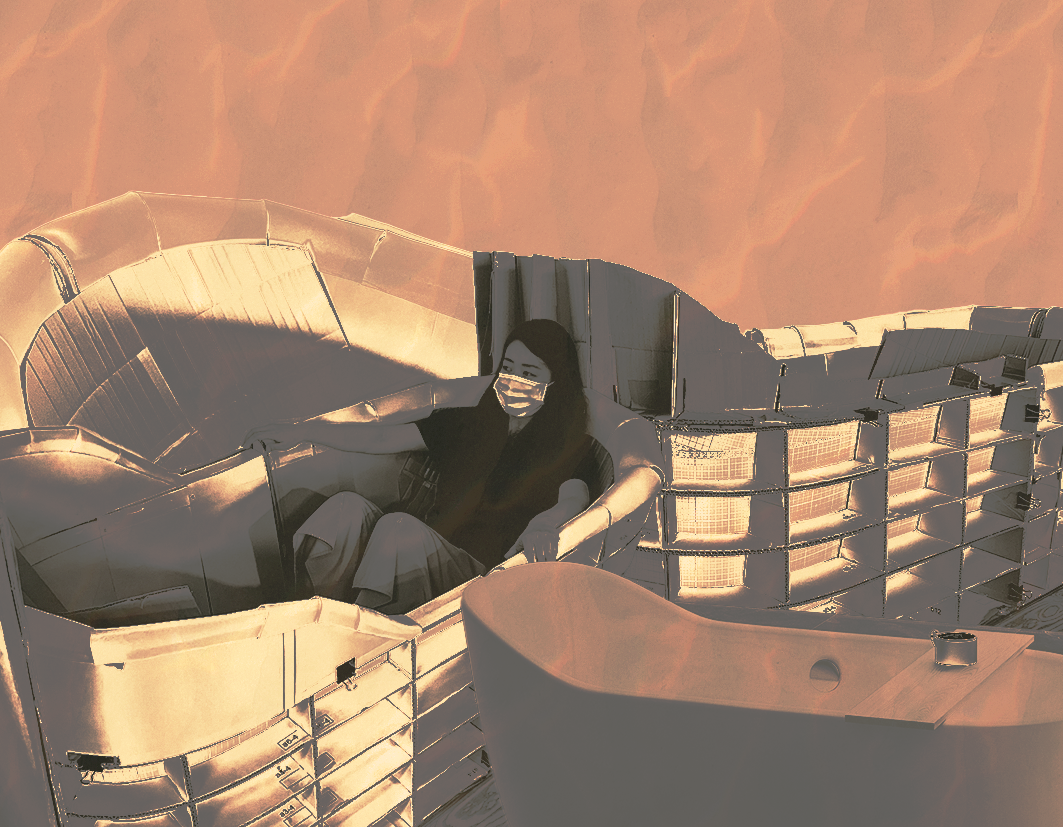
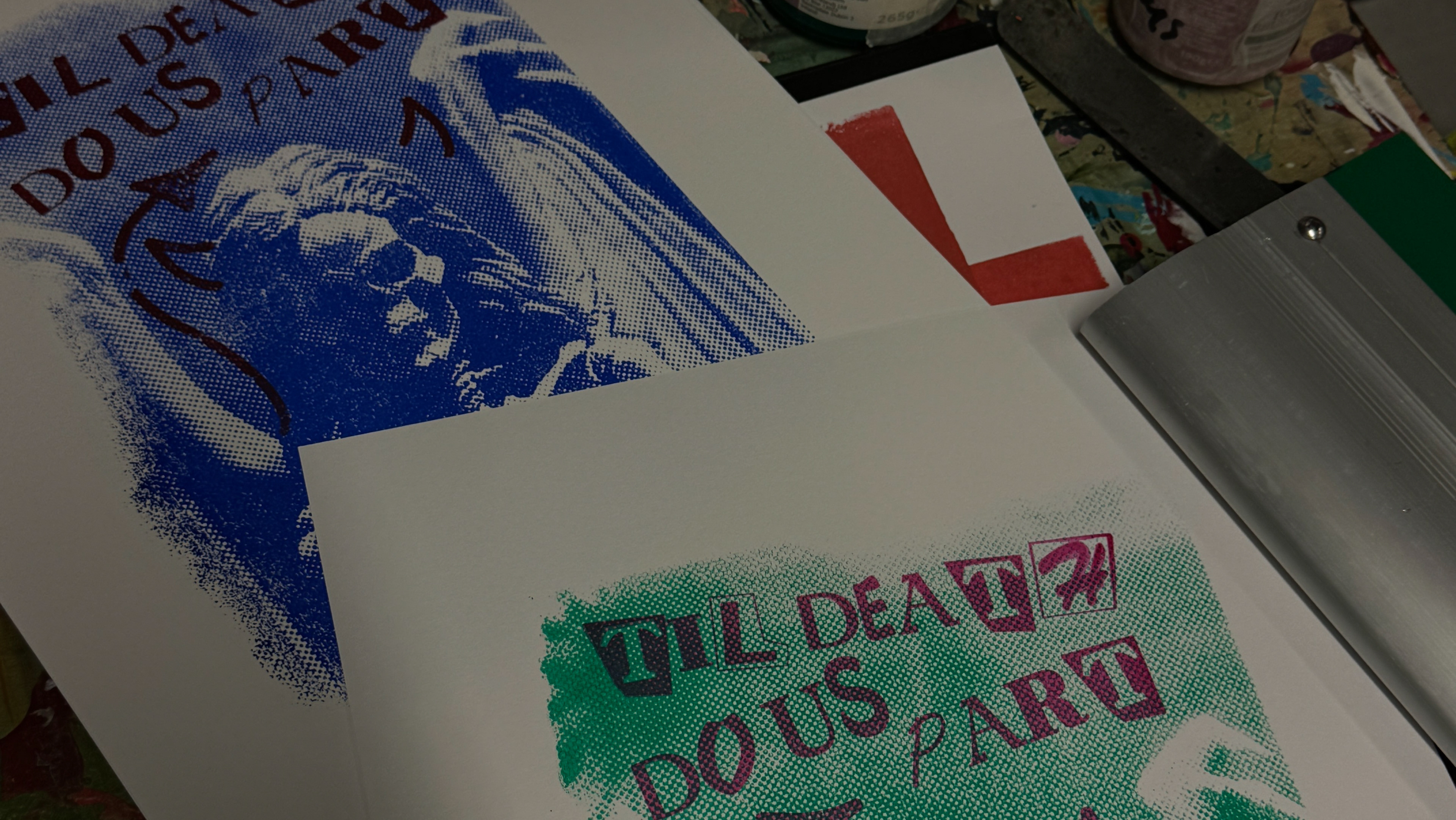
With the poster design I created two versions of each, as the exhibition space was neutral colours I wanted to create posters that would reflect that, however some of the Kuramoto products would have a bright pop of colour so I also created a version that was bright and colourful.
With the postcards/business cards I carried forward the concept of showing the process in the design, however I only created natural designs rather than creating a colourful version
